Reducing Medium, Extender Base, Tinting Medium.
All names for That See-through Stuff, a transparent ink which can be added to other colours. Experience in the studio shows that people have a bit of trepidation about using it and getting to know what it can do. It can be a wee bit tricky to guess or judge its effect, but it really isn’t that frightening. Really. Whats the worst that can happen?
Reducing Medium for oil based inks when squeezed on to the inking surface, looks a bit like honey. Not the clear stuff, but the honey with the comb blend. In the past it could be mistaken for certain types of dryer additives, but they were more like ear wax. Remember that.
If you take a small amount of the reducing medium on your finger or palette knife and smear it thin on paper, it will show as being completely transparent, or see through. So if it is mixed with a colour ink, it will start to effect the opacity of that ink. At this stage it is useful to know that the only ink that is truly opaque is the white – hence Opaque White. The rest, even if used neat, have some form of transparency. The reducing medium increases this.
A good and important tip when mixing is to add the darker colours into the lights. if you do the opposite, you could end up with the entire ink surface covered in ink by the time you get to the colour you want. We don’t like that. Treat Reducing medium as the lightest ink of all, adding colour bit by bit, increasing the value as you go and constantly testing by smearing on paper. A tiny amount of colour – say 5% – will result in a tint or glaze, generally either warm or cool. As you increase the colour it will move closer to the full colour. The dollop of mixed ink can be misleading, looking much more like the full colour than it will ink, hence the importance of smear testing (a whole new experience for male studio users).
There are obvious benefits to making the ink more transparent when overlaying colours. For instance a transparent blue over printed on a yellow will create a green, giving three colours from two print passes. This contrasts with a neat blue, which would just obliterate the yellow. But another use can be in the mixing of colours such as pink. In conventional mixing this would be created from white with red, with the white ink giving a solid pastel pink – a bit like strawberry ice cream. Using reducing medium with red, creates a transparent red, allowing the white of the paper to show, optically making the pink. This can be a warmer, more lively pink than when mixing with white.
Its not all perfect though. The reducing medium changes the consistency of the ink, making it feel ‘slippy’. To counter act this, I usually add some magnesium carbonate, a refined chalk used by weightlifters, rock climbers and gymnasts. This stiffens the ink and lessens the slippy feel.
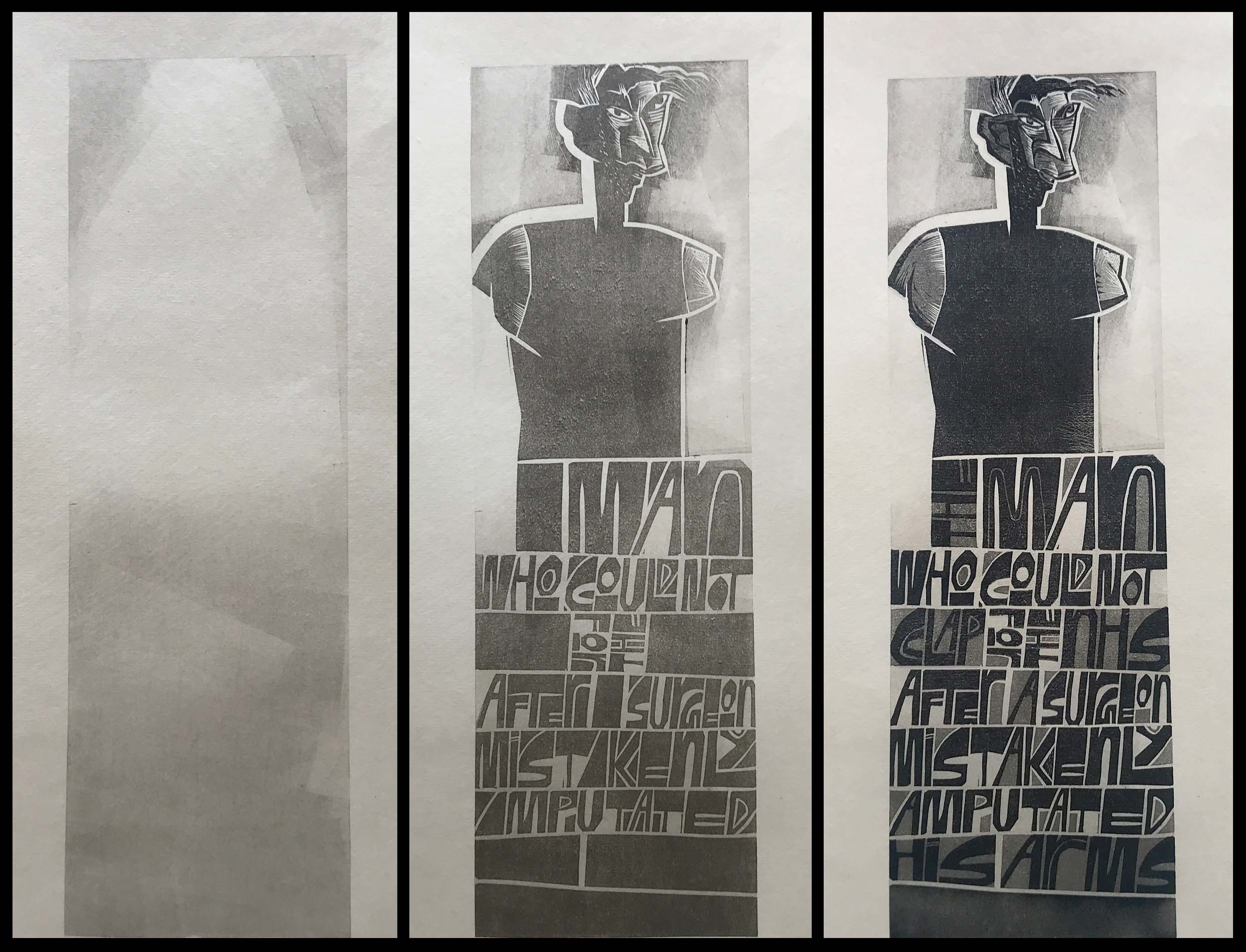
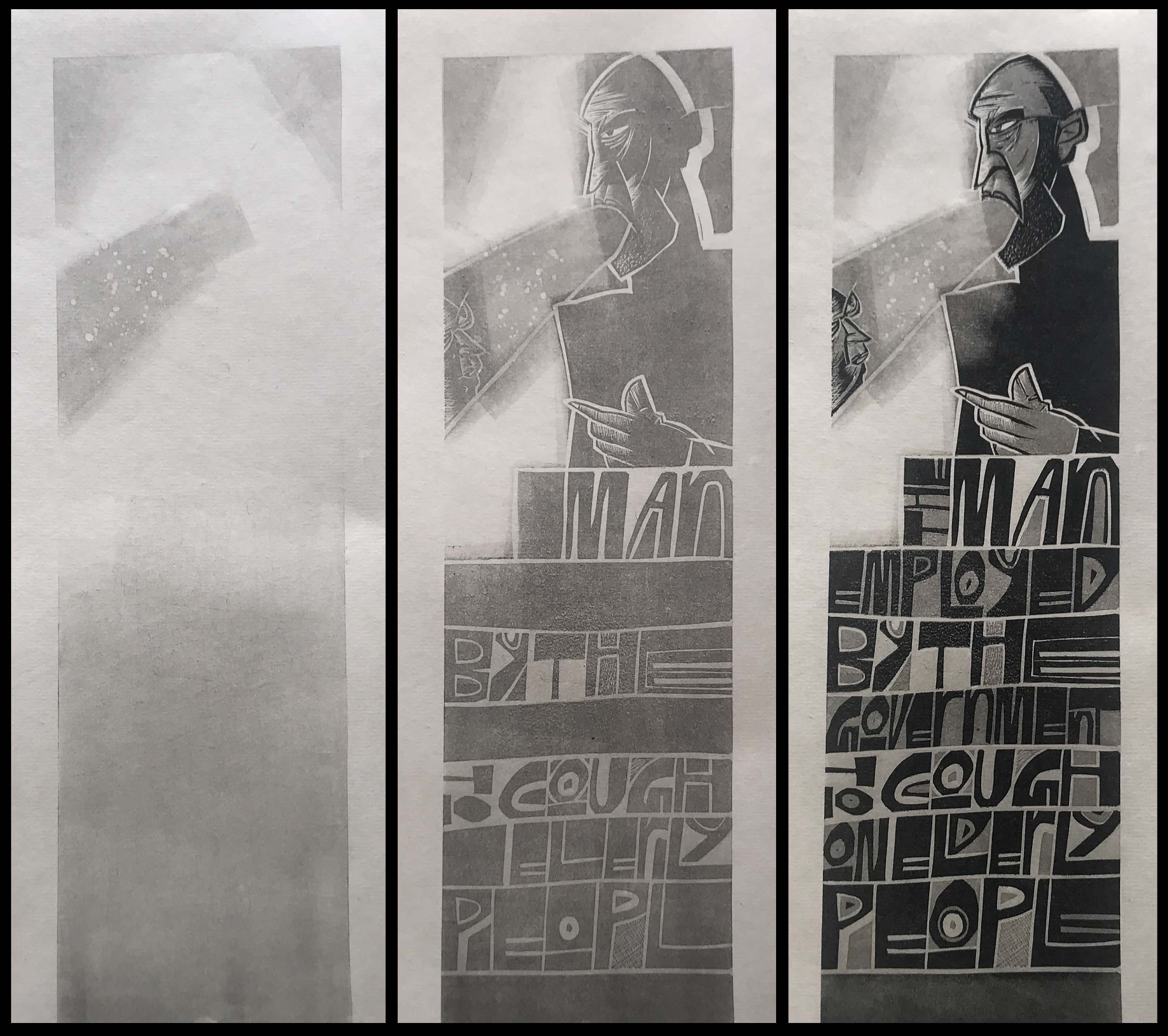
Are you still with me? To illustrate, I thought I could take a step by step photo record of a couple of prints produced during the lockdown. These are three ‘colour’ prints but in fact just use black ink, two times with reducing medium and neat for the final pass.
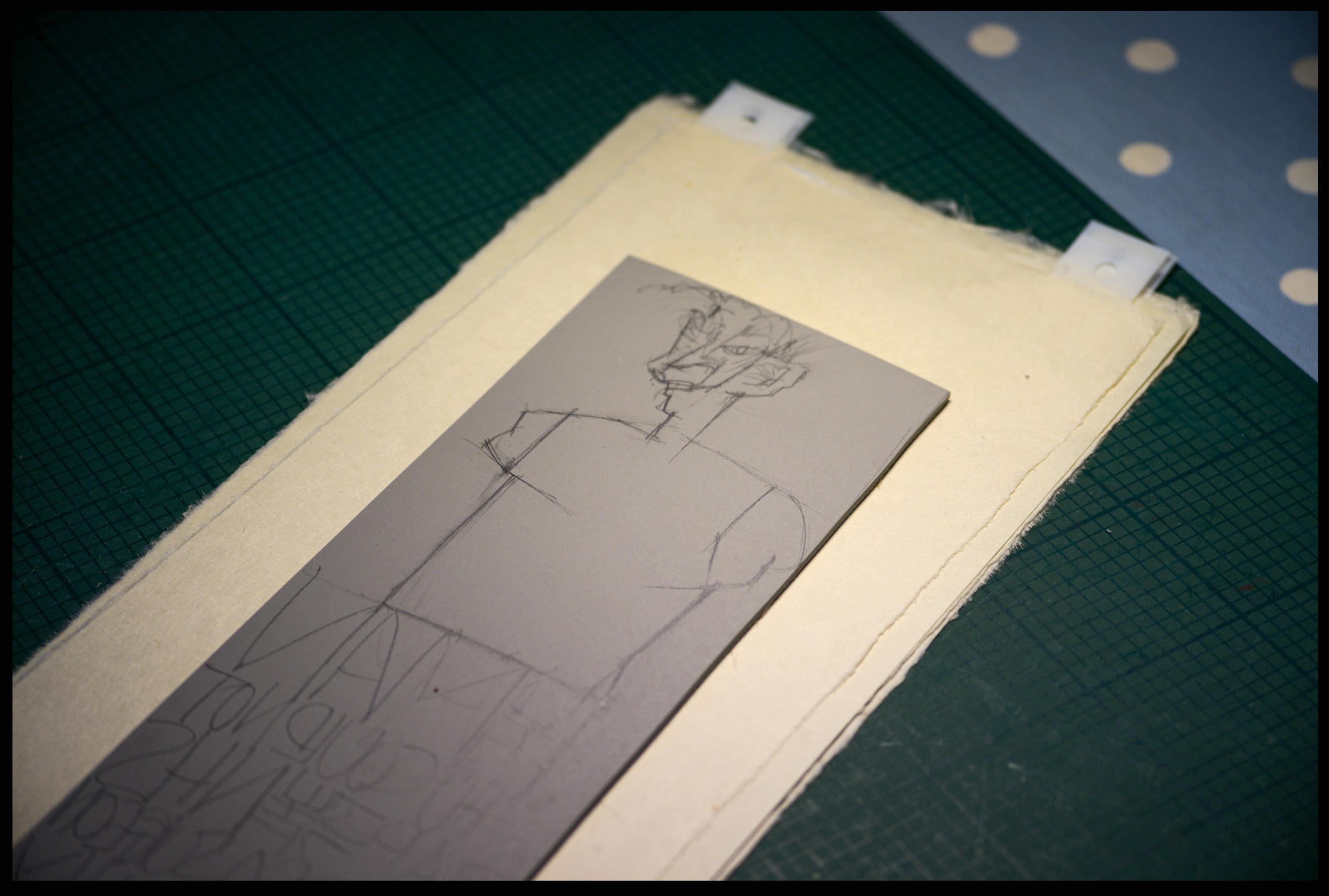
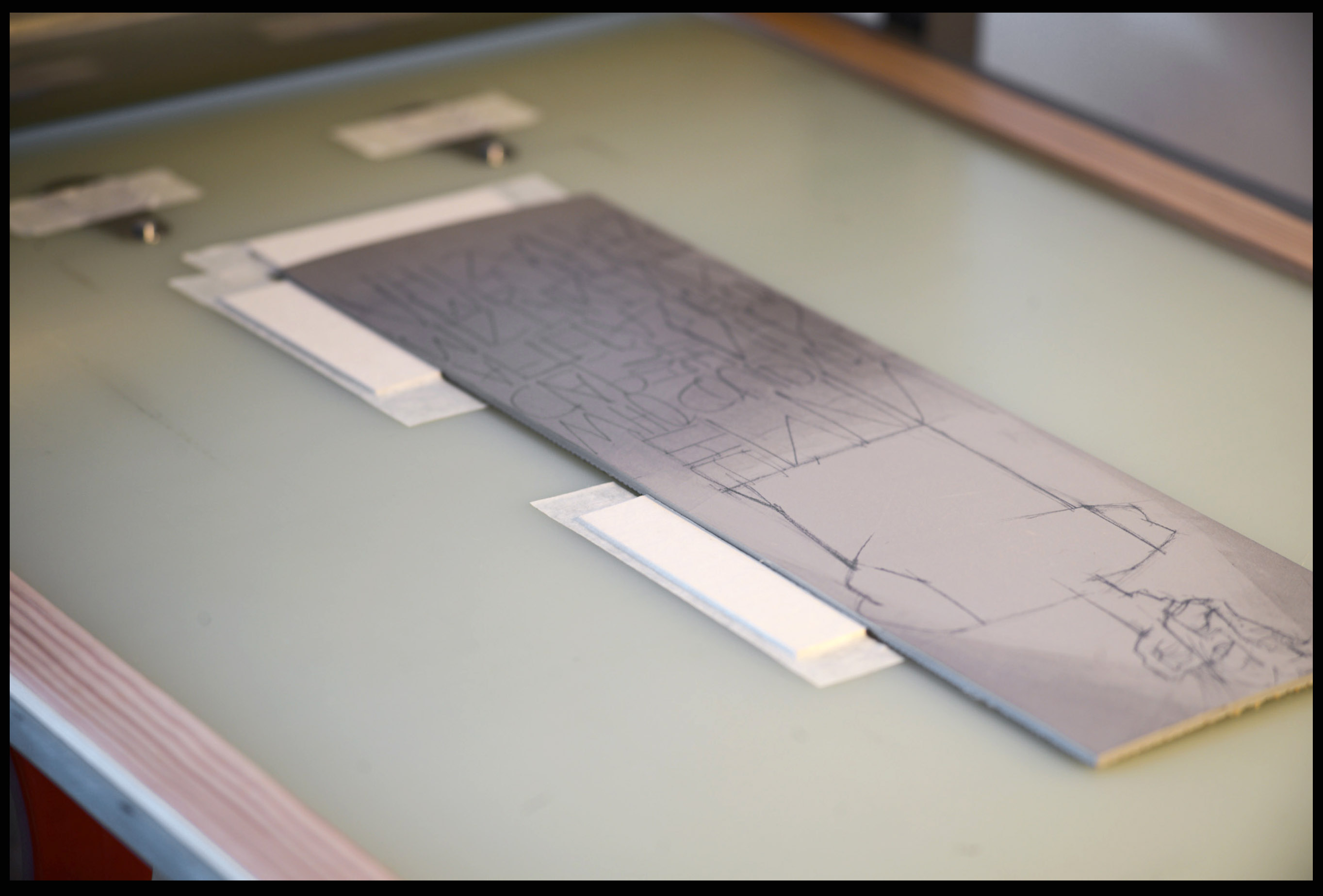
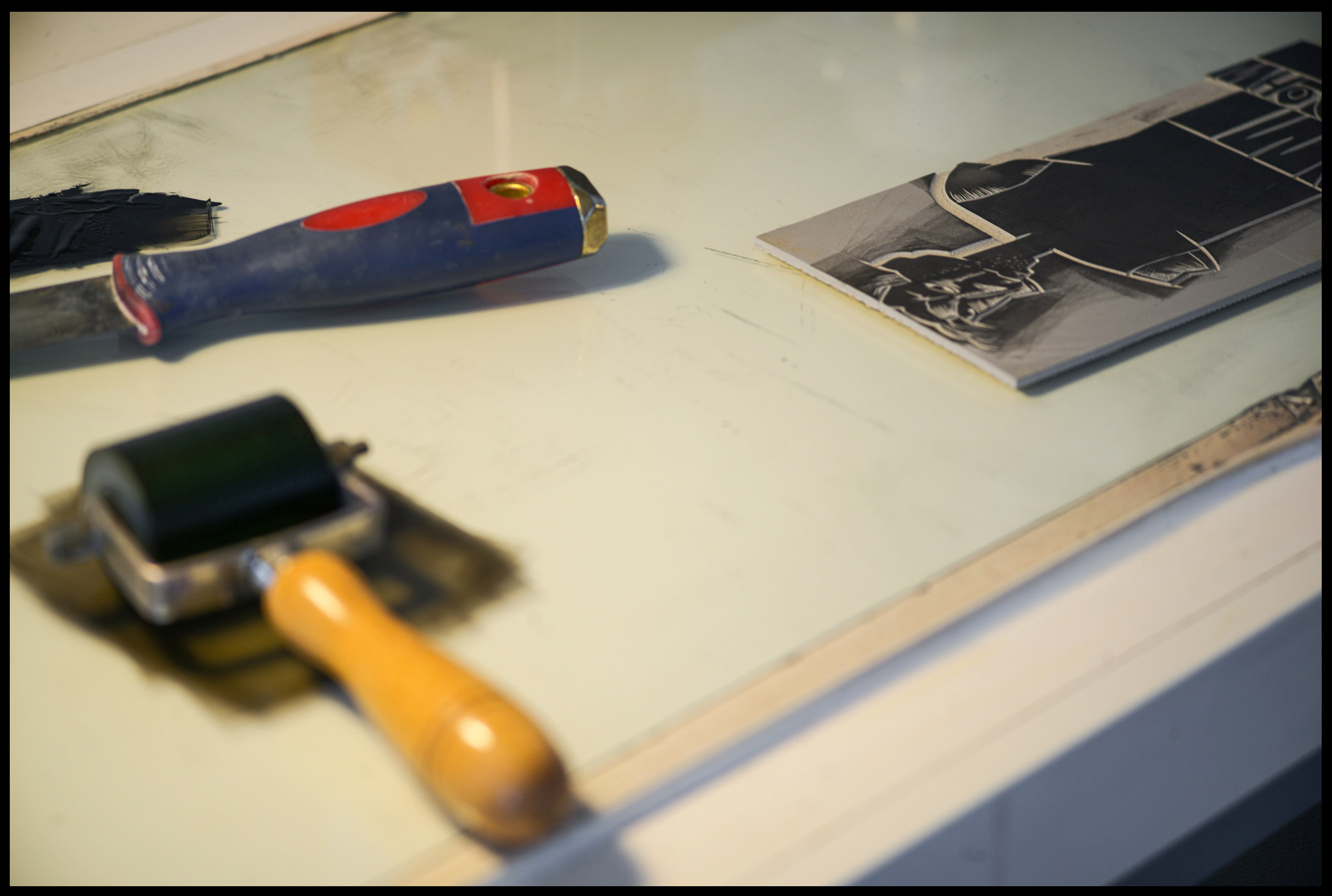
In the first image, the block has been drawn up, and the paper prepared with the Ternes-Burton registration tabs (I’ll be showing a series of short films on the blog looking at this system – coming soon). For the first printing, there is no cutting on the lino block, just applying of ink locally to the block.
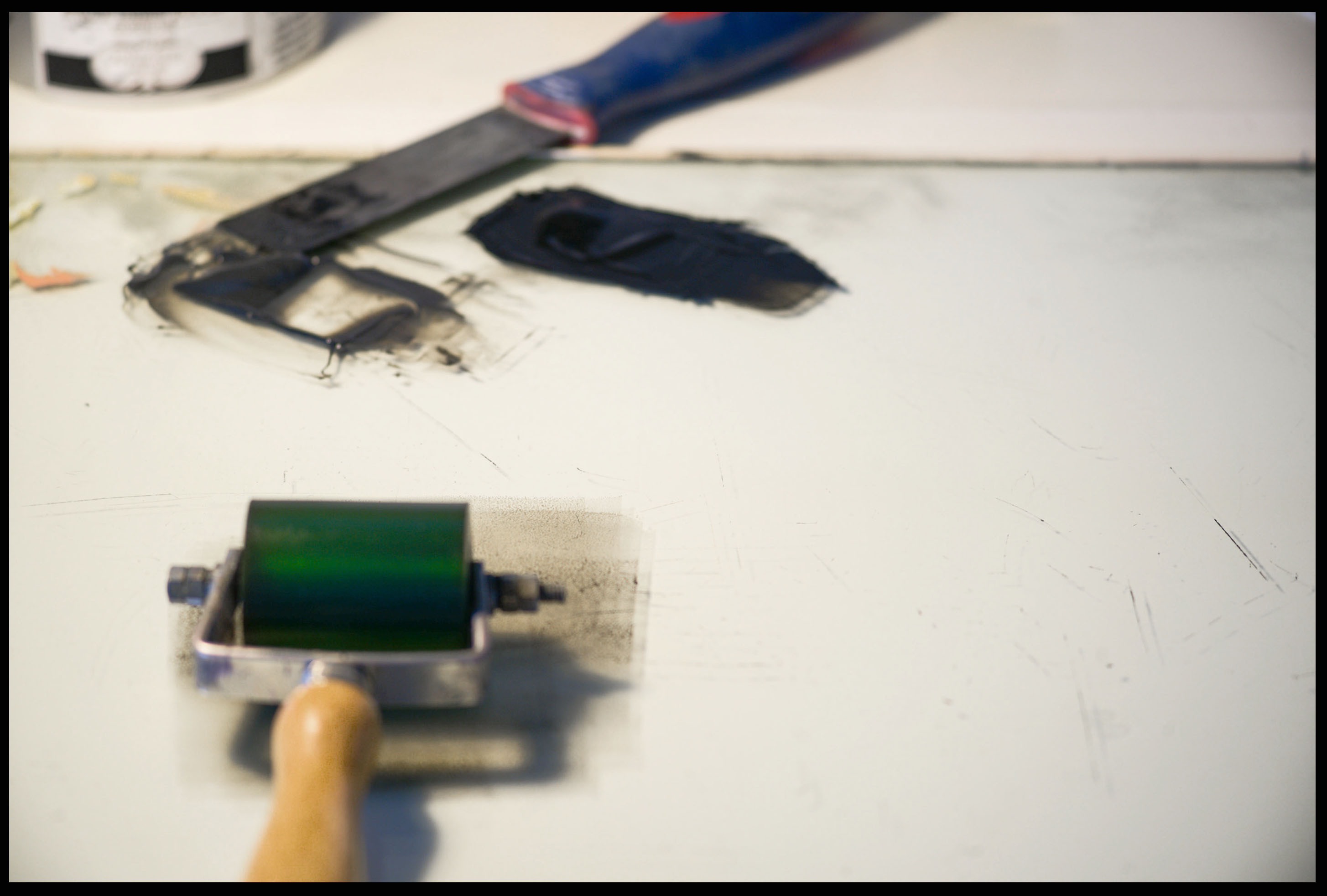
The black ink is mixed in to the extender, probably about 5 – 10% of the total. As a blob it looks reasonably dark, but can hardly be seen when inked on the block, probably easier to see it on the next image at the top and bottom of the block. It has been applied with a small roller and feathered out.
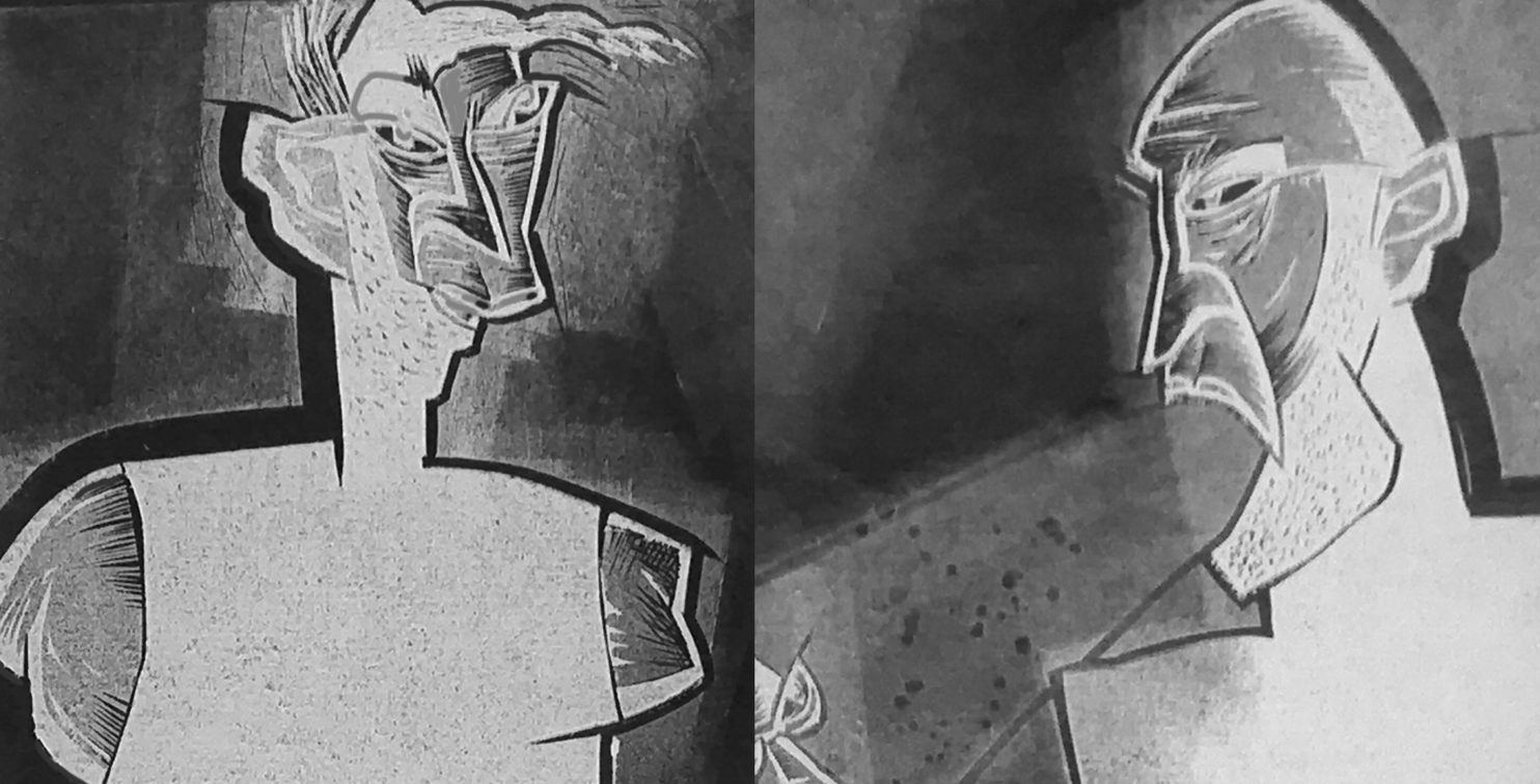
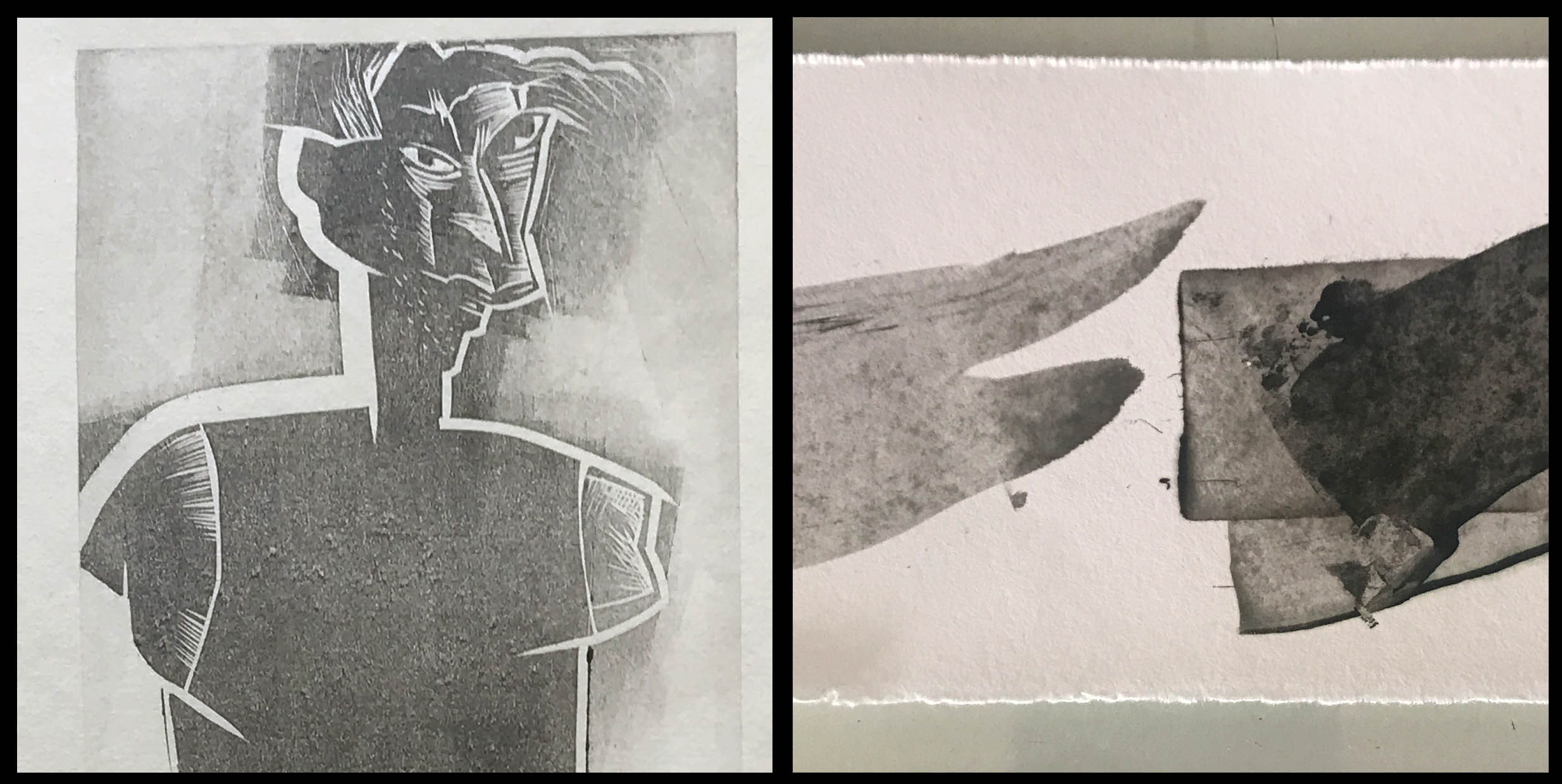
Now printed, the reduced black can be seen printed on the paper, a nice warm, light grey. Cutting can now start for the next inking.
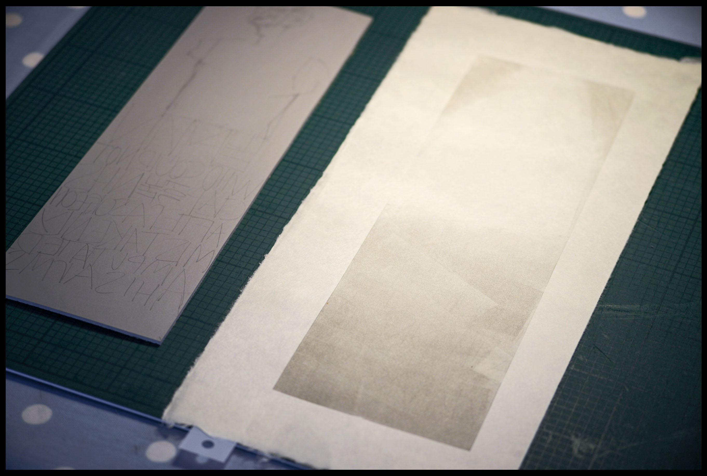
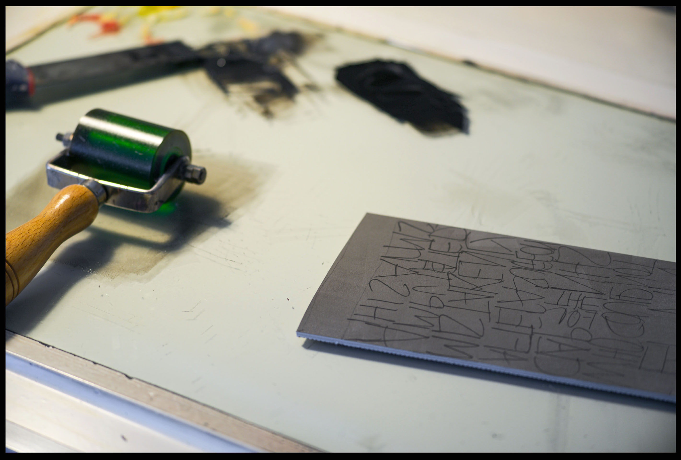
For the 2nd colour, the mid tone, a little more black is mixed in to the previous ink, increasing its strength and aiming to be halfway between the first colour and pure black. In the detail of the resulting print, the mid tone ink is visible, accurate to the testing strip. Again this ink is applied with a small roller, sometimes coming beyond the areas I want, but the image remains defined by the cut lines.
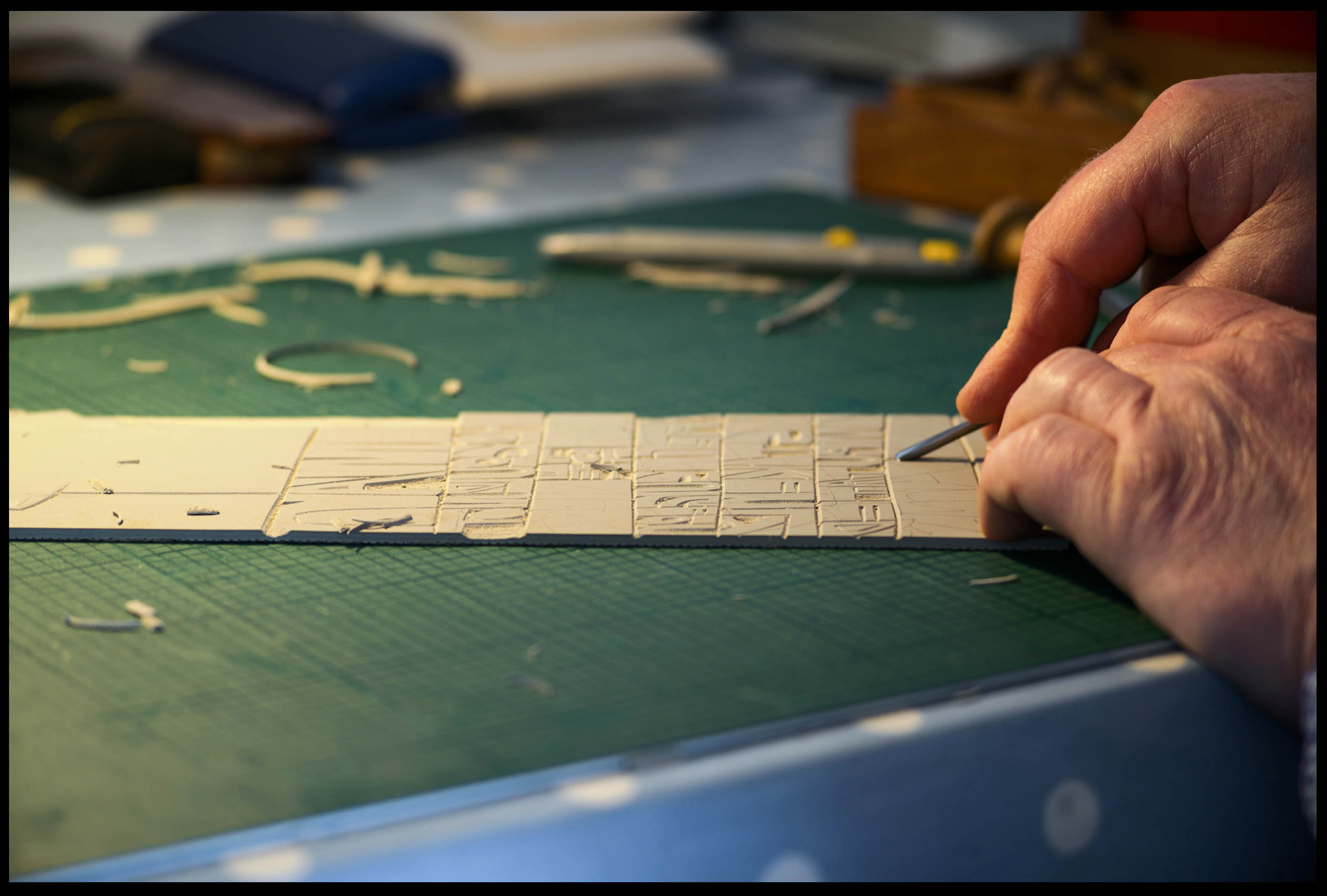
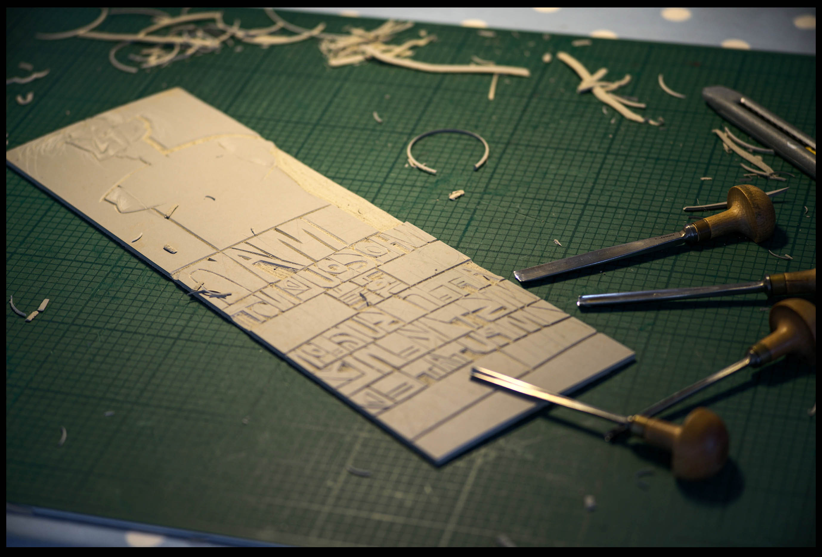
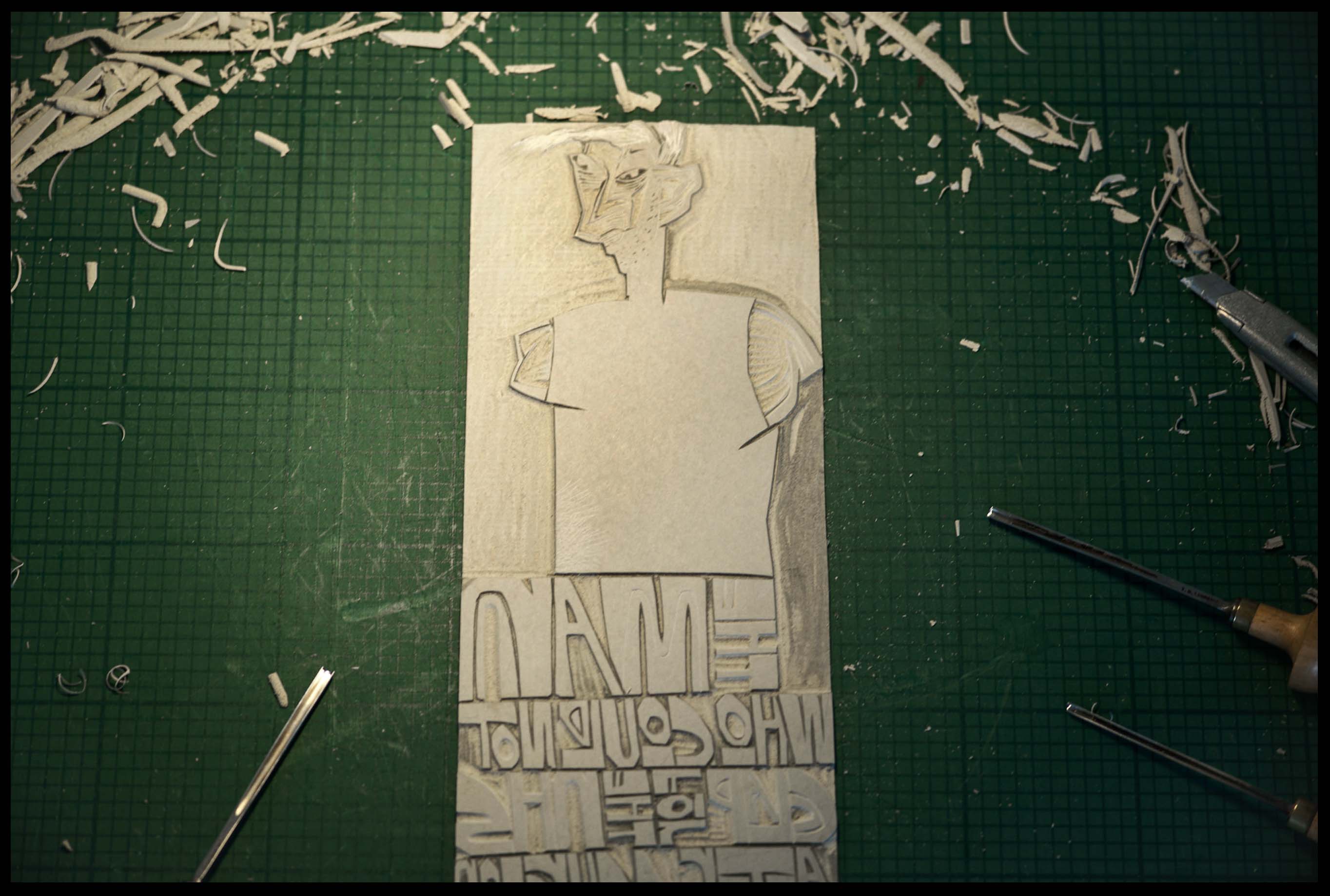
Now the cutting is completed for the final inking. I am cutting away everything I want to remain the mid grey, and inking in neat black.
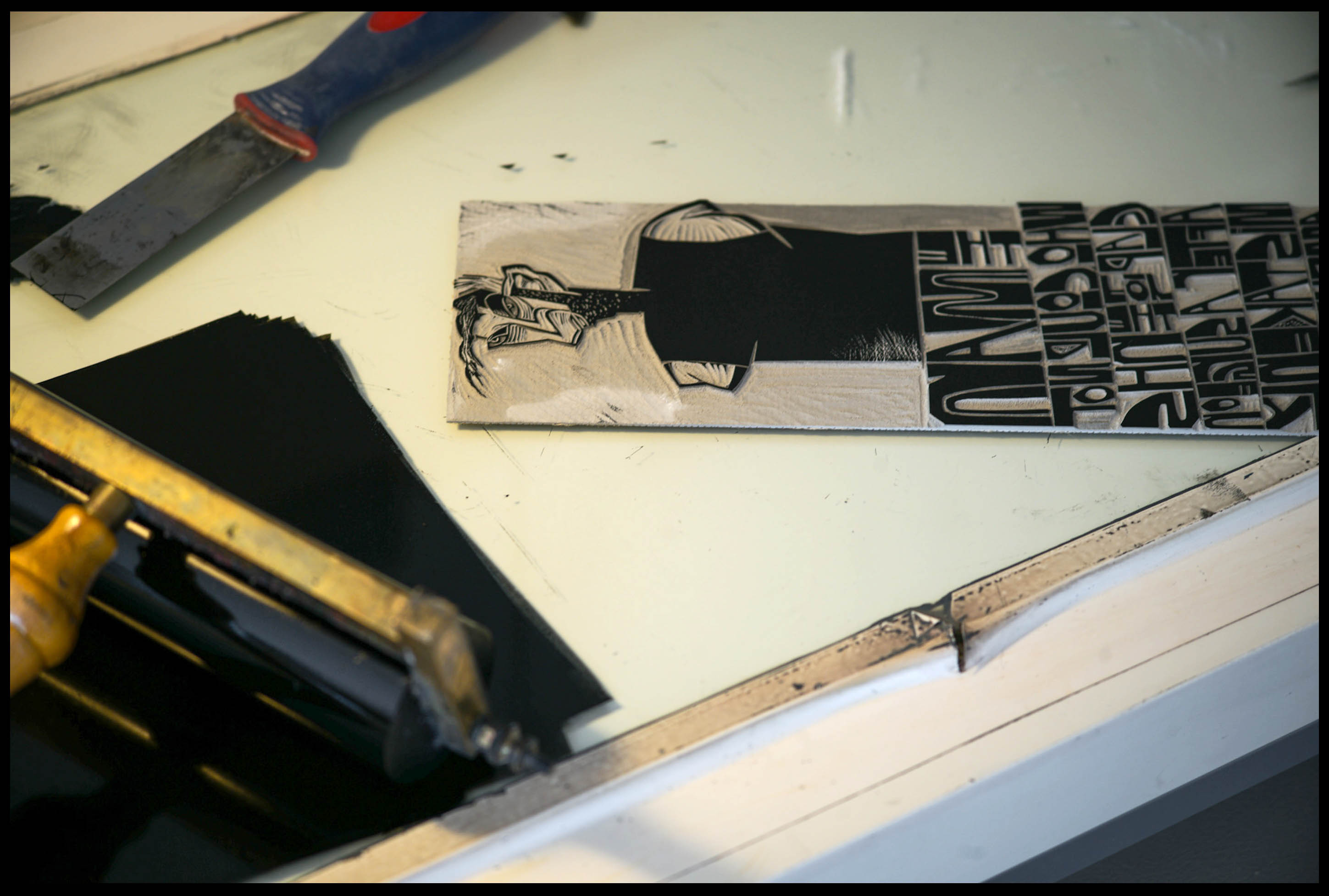
So on this image and it’s sister print, three colours or tones created from black ink, just by adding reducing medium. Once HPS is opened up again, I hope to see a queue for the reducing medium – with 2m gaps of course.
These final images show both prints as they progressed.
John
Comments 6
Thanks, John.
That made it a lot clearer (as did the extender base).
I am a wise guy looking forward to getting back to the studio.
PS
“I went in to a pet shop. I said, ‘Can I buy a goldfish?’
The guy said, ‘Do you want an aquarium?’ I said, ‘I don’t care what star sign it is.’”
Oh Derek. Have you not finished The Bumper Book of Terrible Jokes?
Author
Hi Derek
Thanks. When you do come back to the studio, please leave your joke book at home…
Excellent John. I enjoyed the “jokes” too.
Once again – thank you John for an insight to the finer points of printing.
Dark prints deserve dark humour.
Keep up the great work, it is much appreciated
Author
Thats good to know, glad you are enjoying it. Thanks again.